To Create Form
Display create screen.
* The following explanations are based on "Title/Form Settings" screen of Workflow.
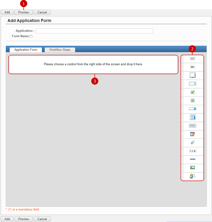
-
Display the form being created in a preview screen.
-
Controls are displayed.
Hold down the mouse button over the grip of a control and move the mouse to the center space. When you release the mouse button, the control is placed.
(Please refer to To Add Control for more details.)
-
The controls you placed are displayed.
Click "Add" button to save and add the data.
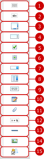
To Add Control
You can freely use 15 form controls to create a form.
-
Add a control to show multi line text.
-
Add a control to show single line text.
-
Add a control to edit multi line text.
-
Add a control to edit single line text.
-
Add a check box control to select multiple items.
-
Add a radio button control to select single item.
-
Add a pull down control to select single item from a list.
-
Add a list box control to select single item from a list.
*You can set the number of items to be shown in the list box instead of only one in the pull down.
-
Add a control to enter a number.
-
Add a control to enter a date.
-
Add a control to set attachment files.
-
Add an auto calculation control to calculate numbers in number controls.
* You can calculate numbers in auto calculation controls.
-
Add a control to show a horizontal line.
-
Add a control to show an image.
-
Add a control to select group.
* Select Group control is displayed only in Workflow.
- Select and Place Controls from Control List
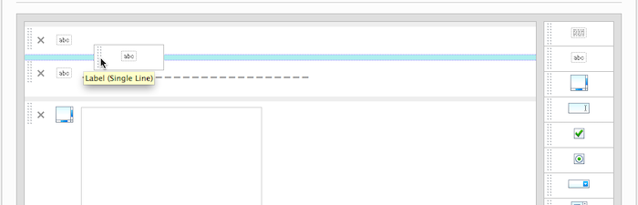
When you press a control and hold down the mouse button, and then move to the center space, the blue border is displayed where you can place the control.
When you release the mouse button, the control is placed.
* If you choose a control from the control list and insert the control, the setting window is open automatically.
* If you want to open the setting window after you placed a control, press the icon of a control.
* If a controls is "Label (Single Line)" or "Label (Multi Line)" and its Text Alignment is "Center" or "Right", you cannot place controls on the left and right of the control.
* You cannot place controls on the right of a "Horizontal Line" control.
To Move Control
You can move controls you placed by using mouse easily.
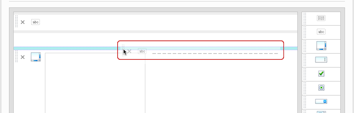
When you press and hold down the mouse button over the left side of a control, you can move the control.
If the mouse pointer is near a place where you can move the control, the blue border is displayed. When you release the mouse button, the control is moved.
* If a controls is "Label (Single Line)" or "Label (Multi Line)" and its Text Alignment is "Center" or "Right", you cannot place controls on the left and right of the control.
* You cannot place controls on the right of a "Horizontal Line" control.
To Edit Control
You can edit added controls.
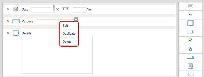
When you press a control, the ▼ icon is displayed.
When you press the ▼ icon, a menu is displayed where you can choose one of the following operations.
-
Edit... Edit Control window is displayed.
-
Duplicate... Duplicate Control window is displayed.
(Please refer to To Duplicate Control for more details.)
-
Delete... deletes control.
To Duplicate Control
You can duplicate added controls.
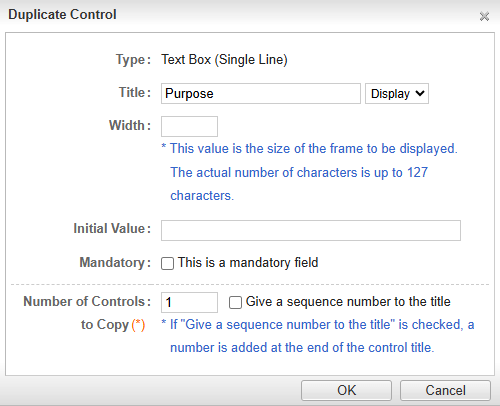
You can duplicate added controls by specifying the number of controls to copy.
* You can add a sequence number when copying controls that have customizable titles.
* The number of duplicates allowed at a time is 1 to 99.
Duplicated controls are displayed with a green border.

To Display Preview
When you press "Preview" button, you can see how the controls you entered are displayed.
You can check text decorations and locations of controls.
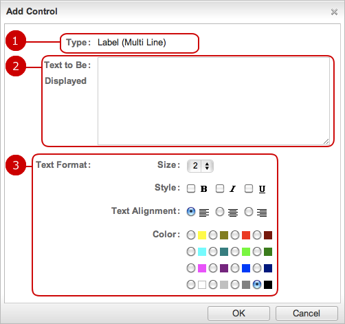
To Add a Control (Label (Multi Line))
With this control, you can set size, color, etc. to text. Since it allows to display multi line text, it can be used to display important text.
-
The type of control is displayed.
-
Enter a text.
-
Set the text format.
Size... Choose a size of 1 to 9.
Style... Choose "Bold", "Italic" or "Underline".
Text Alignment... Choose "Left", "Center" or "Right".
Color... Choose a color of 16 colors.
-
You can specify the number of controls to add.
You can add 1 to 99 items at a time.
After all entries are completed, when you press "OK" button, the control is added.
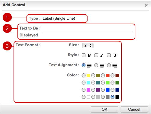
To Add a Control (Label (Single Line))
With this control, you can set size, color, etc. to text. It can be used for a title.
-
The type of control is displayed.
-
Enter a text.
-
Set the text format.
Size... Choose a size of 1 to 9.
Style... Choose "Bold", "Italic" or "Underline".
Text Alignment... Choose "Left", "Center" or "Right".
Color... Choose a color of 16 colors.
-
You can specify the number of controls to add.
You can add 1 to 99 items at a time.
After all entries are completed, when you press "OK" button, the control is added.
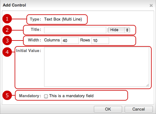
To Add a Control (Text Box (Multi Line))
This control can be used to enter multi line text in Workflow or Questionnaire.
-
The type of control is displayed.
-
Enter a title text of the control.
If you choose "Display", the title text is displayed on the input field.
-
Set the number of columns (width) and rows (height).
-
Enter a text displayed as the initial text.
* You can use a maximum of 2000 characters.
-
Check if this field is a mandatory field.
If you choose this option, * symbol is displayed.
-
You can specify the number of controls to add.
You can add 1 to 99 items at a time.
* If "Give a sequence number to the title" is checked, a number is added at the end of the control title.
After all entries are completed, when you press "OK" button, the control is added.
To Add a Control (Text Box (Single Line))
This control can be used to enter a comment in Workflow or Questionnaire.
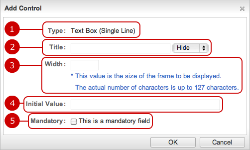
After all entries are completed, when you press "OK" button, the control is added.
To Add a Control (Check Box)
Use this control to select multiple items.
This can be used to select multiple answers to a question in Questionnaire.
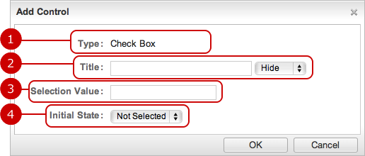
After all entries are completed, when you press "OK" button, the control is added.
To Add a Control (Radio Button)
Use this control to choose one item.
This is useful to ask meeting attendance (e.g. attendance, nonattendance).
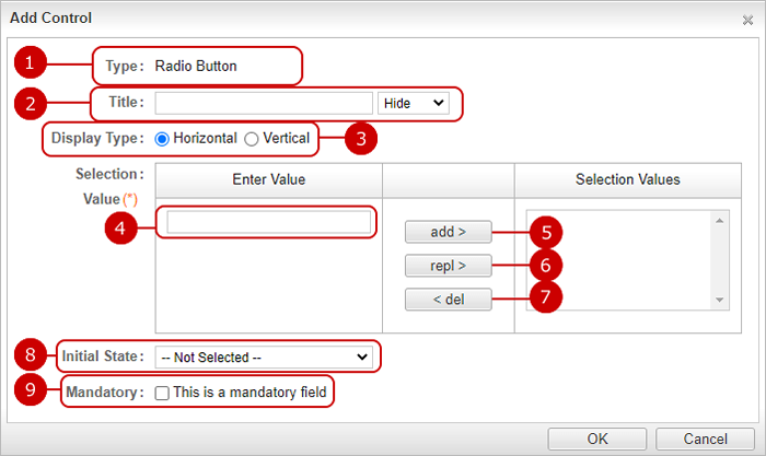
After all entries are completed, when you press "OK" button, the control is added.
To Add a Control (Pull down)
Use this control to choose one from several items.
The control can be used when you want to make a selection, for example place of business trip.
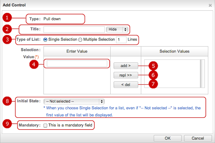
After all entries are completed, when you press "OK" button, the control is added.
To Add Control (List Box)
Use this when selecting from multiple items.
The control can be used when you want to make a selection, for example place of business trip.
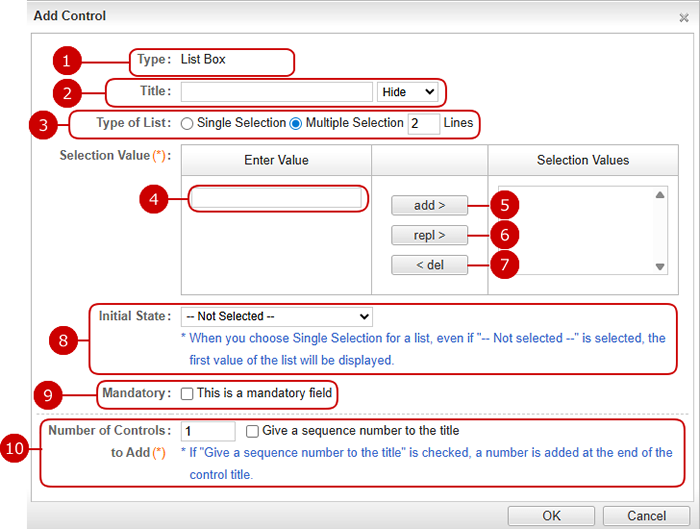
After all entries are completed, when you press "OK" button, the control is added.
To Add a Control (Numbers)
The control can be used to enter number such as amount, quantity.
* You can use the controls with auto calculation controls to calculate numbers.
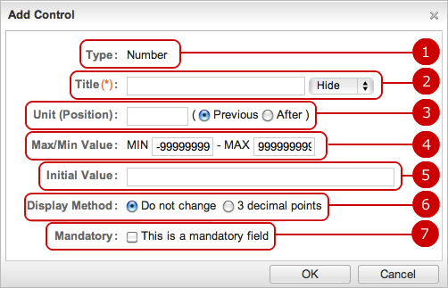
After all entries are completed, when you press "OK" button, the control is added.
To Add a Control (Date)
The control can be used to enter a date.
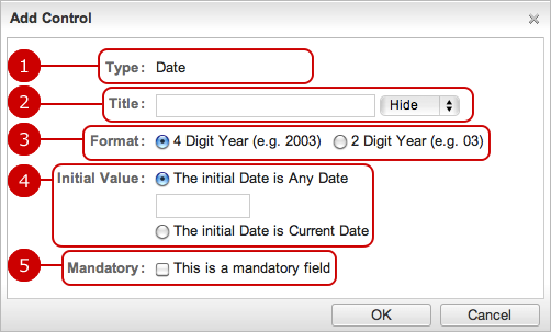
After all entries are completed, when you press "OK" button, the control is added.
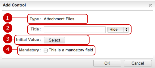
To Add a Control (Attachment File)
Files can be attached with a report or application.
-
The type of control is displayed.
-
Enter a title text of the control.
If you choose "Display", the title text is displayed beside of the attachment file field.
-
Enter a file name as the initial value.
* Selecting too many files is restricted when an administrator has set a limit of attachment file size.
* It depends on the settings of each application where files are attached to.
* Each single control of Attachment Files of application forms has its limit. (A record may have several controls that attach files.)
-
Check if this field is a mandatory field.
If you choose this option, * symbol is displayed.
-
You can specify the number of controls to add.
You can add 1 to 99 items at a time.
* If "Give a sequence number to the title" is checked, a number is added at the end of the control title.
After all entries are completed, when you press "OK" button, the control is added.
To Add a Control (Auto Calculation)
You can perform arithmetic operations and summarize for number controls.
Since calculation results can be used for another Auto Calculation control, you can perform several arithmetic operations.
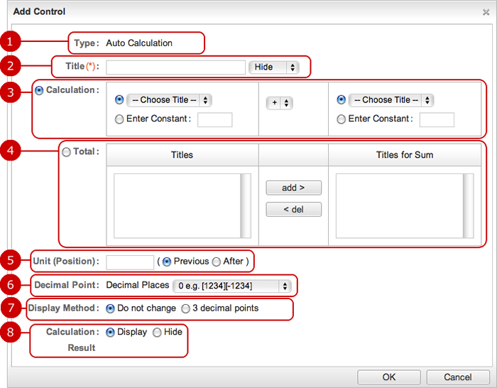
After all entries are completed, when you press "OK" button, the control is added.
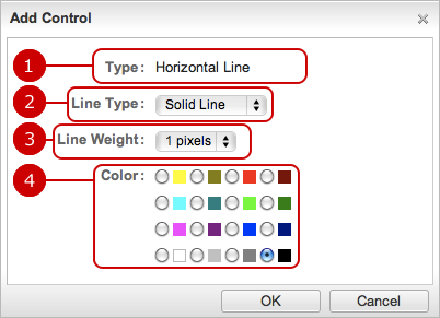
To Add a Control (Horizontal Line)
Show a horizontal line to separate fields.
-
The type of control is displayed.
-
Choose the line type.
Choose any one of Solid Line, Dotted Line, Dashed Line.
-
Choose the line weight.
Choose any one of 1 to 3 pixels.
-
Choose the color.
Choose any one of 16 colors.
-
You can specify the number of controls to add.
You can add 1 to 99 items at a time.
After all entries are completed, when you press "OK" button, the control is added.
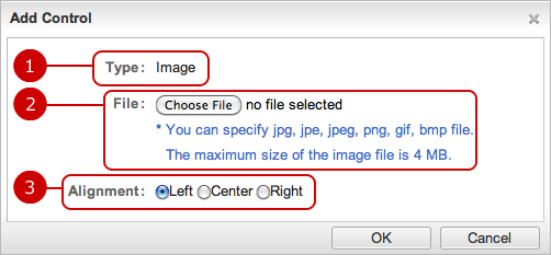
To Add a Control (Image)
Show image such as logo.
-
The type of control is displayed.
-
Choose a file to show.
-
Choose any one of Choose "Left", "Center" or "Right".
-
You can specify the number of controls to add.
You can add 1 to 99 items at a time.
After all entries are completed, when you press "OK" button, the control is added.
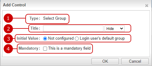
To Add Control (Select Group)
This control is used to select a group.
* This control is displayed only in Workflow.
-
The type of control is displayed.
-
Enter a title text of the control.
If you choose "Display", the title text is displayed beside of the select button.
-
You can left the initial value as not configured, or use the login user's default group.
* If login user's default group is not set, it will be left empty.
-
Check if this field is a mandatory field.
If you set it as a required item, * mark will be displayed.
-
You can specify the number of controls to add.
You can add 1 to 99 items at a time.
* If "Give a sequence number to the title" is checked, a number is added at the end of the control title.
After all entries are completed, when you press "OK" button, the control is added.
